
We have been keeping a secret.
However, it's now time to share the exciting news.
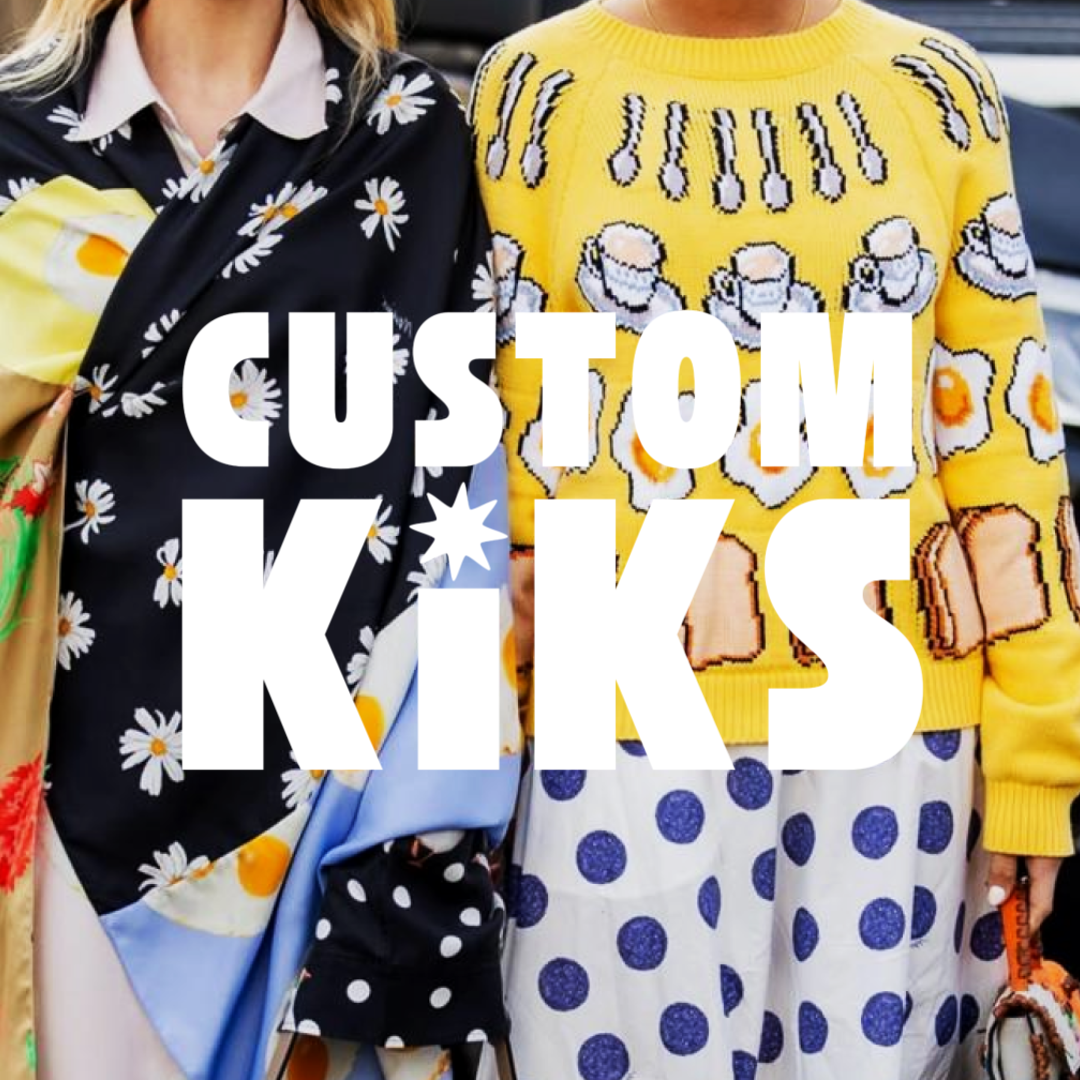
Custom Kiks has a new look.
Now, we'd like to tell you all about it. Let's start from the beginning.

I started following Kelly Packard on IG maybe a decade ago. She always had such a cool energy—her design and personal aesthetic permeating everything she posted. I thought, “If I ever need help with branding, I’m calling her.”
That day came in early February of 2025.
Custom Kiks had been around since 2017, and the original look and feel had never been touched—in com time, that’s decades. The designs are evolving, and our community is growing, but the brand? It still looked like day one.
We needed a spark—a reason to fall in love with the brand again.
So I reached out to Kelly.
What followed was a whirlwind of creative exploration, deep conversations about identity, and a full-blown reimagining of what Custom Kiks could be—a store, a creative brand, a tribe, and a platform for self-expression.
THE ORIGINAL CUSTOM KIKS LOGOS AND WORDMARKS CREATED IN 2017:

SOME OF THE INITIAL IDEAS WE WERE EXPLORING:

THIS CONCEPT FELT MORE LIKE GOING IN THE RIGHT DIRECTION:

THE FINAL RESULT:
IMPLEMENTATION - WORKING THROUGH WHAT OUR BOXES SHOULD LOOK LIKE:

IMPLEMENTATION - OUR STOREFRONT LOOK AND FEEL (MORE ON THAT LATER):

OUR OLD HOMEPAGE FOR REFERENCE:

WHY REBRAND?
This wasn’t about a new logo.
It was about alignment.
Custom Kiks has always been for people who want something meaningful on their feet—shoes that tell stories, start conversations, and make you feel something. But our old branding didn’t quite do that justice. It felt like a first draft we had outgrown.
WHAT CHANGED?
🎯 A Clearer Identity
Kelly helped bring to life the vision I had in my head—what Custom Kiks really is today and where it is headed. The new identity is expressive, elevated, clean, and bold. Our shoes are loud and colorful; the brand is now the confident frame that lets them shine. Want to know more? Check out our Manifesto, a.k.a., our Constitution and Northstar.
👟 A Visual System That Grows With Us
From the typography (Kelly chose Helvetica—a font I’ve loved since design school; I’ve literally carried a tiny book about it for years) to the color palette, logo, packaging, and digital experience, we now have a brand system that supports every kind of drop, from parties to corporate collaborations.
IT WAS MEANT TO BE:

🌱 Values, Front and Center
Sustainability, transparency, and individuality have always been part of our DNA. The rebrand just made them louder.
We only produce what you order—no waste, no dead stock. We work with partners we trust. And we see it as a privilege to build something slowly and intentionally. Watching it grow? That’s the reward.
WHAT’S STAYING THE SAME?
Everything that matters.
We’re still indie. Still weird. Still personal.
Still making shoes that mean something.
Still telling your story—one pair at a time.
WHAT’S COMING NEXT?
Something fresh is on the horizon.
This Mother’s Day, we’re unveiling a new look, a refreshed experience, and a heartfelt tribute to love, memory, and legacy.
This isn’t a reinvention.
It’s a reflection.
A return to what matters most.
And yes—there’s more to come. We can’t wait to step into this next chapter—with you walking right beside us.
-Alex